|
Creating a Centroid Plot
Overview
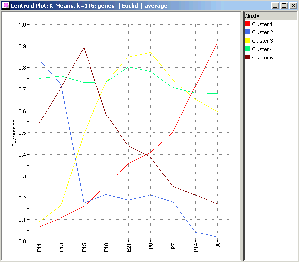
A centroid plot can be used to visualize the centroid or exemplar profile for each of the clusters resulting from a partitional clustering experiment. For example, if you select a K-Means clustering experiment where K=5, a centroid plot of it shows 5 profiles. Each profile represents the average value for all of the members of one of the clusters.
If genes were clustered, each of the profiles represents the average expression value for the genes in a cluster over all samples.
If samples were clustered, each of the profiles represents the average expression value for the samples in a cluster over all genes .
By selecting one or more cluster centroids and then launching a cluster plot, it is possible to visually 'drill down' into the clusters to view the individual member profiles.
Actions
1. Click a Partitional Clustering experiment in the Experiments navigator. The item is highlighted.
2. Select Centroid Plot from the Clustering menu, or right-click the item and select Centroid Plot from the shortcut menu. A plot of all cluster centroids is displayed.

Using the Plot
Displaying an Expression Value
Plot Functions
Create Gene List from Selection or Cluster
Customizing the Plot
Related Topics:

