|
Creating a SOM Centroid Plot
Overview
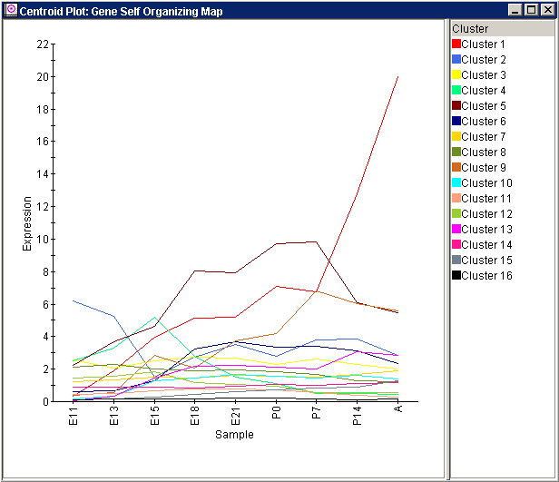
A centroid plot from a SOM plot can be used to see the profiles of the values in the dataset that have been associated with a particular node.
Actions
1. Click on a SOM experiment in the Experiments navigator. The item is highlighted.
2. Select Centroid Plot from the Clustering menu, or right-click on the item and select Centroid Plot from the shortcut menu. A centroid plot of the SOM experiment is displayed.

Interpretation
The SOM centroid plot shows the characteristics of the clusters, i.e., the representative profile (the centroid) and the fitness of the cluster in terms of the standard deviation above and below the representative. This provides important abstract information about how the gene expression data relates to the clustering provided by the SOM. It also shows the corresponding node's reference vector, which allows comparison of the representative profile of the cluster with the node's reference vector to determine how well (on average) the points associated with that node actually match that node's characteristics.
Using the Plot
Displaying an Expression Value
Plot Functions
Create Gene List from Selection or Cluster
Customizing the Plot
Related Topics:
Overview of Self-Organizing Maps (SOMs)
Tutorial 4: Self-Organizing Maps

