|


Creating a SOM Matrix Tree Plot
Overview
Tree plots are used to visualize clustering relationships. GeneLinker™ displays a tree plot in conjunction with a color matrix display of values, typically gene expression levels. A legend displays a color gradient and the scale from the minimum to maximum expression value range. The cluster tree appears to the right of the color array (when samples are clustered), or below the color matrix plot (when genes are clustered).
Actions
1. Click on a SOM experiment in the Experiments navigator. The item is highlighted.
2. Click the Matrix
Tree Plot toolbar icon ![]() , or select Matrix
Tree Plot from the Clustering
menu, or right-click the item and select Matrix
Tree Plot from the shortcut menu. A matrix tree plot of the SOM
experiment is displayed.
, or select Matrix
Tree Plot from the Clustering
menu, or right-click the item and select Matrix
Tree Plot from the shortcut menu. A matrix tree plot of the SOM
experiment is displayed.
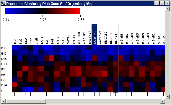
Plot Indicators
As you move the mouse pointer over a gene or sample name, a gray bounding box is drawn around its column or row so you can easily see which tiles belong to it.
The names of one or more selected items (genes or samples) are highlighted in dark blue with white text. It is not possible to select genes and samples concurrently.
Hover the mouse pointer over a colored tile to see the gene name, sample name and value in a tooltip.
Interacting With the Plot
Displaying a Gene Expression Value
Plot Functions
Color by Gene Lists or Variables
Customizing the Plot
Changing the Gradient Color and Scale
Resizing Cells in a Color Grid
Toggling the Color Grid On or Off
Related Topics:
Overview of Self-Organizing Maps (SOMs)
Tutorial 4: Self-Organizing Maps