|


Creating a Matrix Tree Plot
Overview
Tree plots visually highlight clustering relationships. They are indispensable for hierarchical clusterings, and can also be used to view partitional clusterings (K-Means and Jarvis-Patrick), and SOMs.
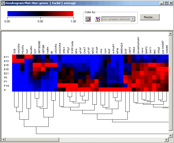
The matrix tree plot is a combined display of a tree plot and a color matrix. At the top, the plot legend consists of a color gradient above an expression value scale. The default range for the scale is from the minimum to the maximum value contained within the dataset. The cluster tree appears to the right of the color array when samples are clustered, or below it when genes are clustered.
The tree for a hierarchical clustering is a close reflection of the agglomerative algorithm that produced it. Consider gene clustering: two very similar genes are joined at a 'node', representing a cluster. That line is joined to the next nearest gene or sub-cluster by another line a little lower, and so on. In the end, closely related genes tend to appear beside each other in the diagram. (Note that the converse is not true - genes appearing beside each other in the tree diagram are only closely related if they are also linked by lines).
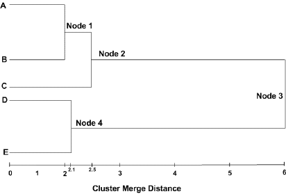
In the picture above:
Cluster Node 1 contains A and B
Cluster Node 2 contains A, B, and C
Cluster Node 3 contains A, B, C, D and E
Cluster Node 4 contains D and E
Cluster Node 1 merged together the 'closest', Cluster Node 4 the next 'closest', and Cluster Node 2 the next 'closest' after that. Cluster Node 3 contains all the items from the entire dataset, representing the cluster with the largest distance between its members.
For partitional clustering, there is a separate comb for each cluster, and the combs have only one level (hence the alternative name 'flat clustering'.) All items (genes or samples) in a cluster appear together but no further ordering is done on the items within a cluster.
Actions
1. Double-click a hierarchical or partitional clustering experiment in the Experiments navigator. The item is highlighted and a matrix tree plot of the selected item is displayed.
OR
1. Click a hierarchical or partitional clustering, or a SOM experiment item in the Experiments navigator. The item is highlighted.
2. Click the Matrix
Tree Plot toolbar icon ![]() , or select Matrix
Tree Plot from the Clustering
menu, or right-click and select Matrix
Tree Plot from the shortcut menu. A matrix tree plot of the selected
item is displayed.
, or select Matrix
Tree Plot from the Clustering
menu, or right-click and select Matrix
Tree Plot from the shortcut menu. A matrix tree plot of the selected
item is displayed.
Plot Indicators
As you move the mouse pointer over a gene or sample name, a gray bounding box is drawn around its column or row so you can easily see which tiles belong to it.
The name of selected genes or samples are highlighted in dark blue with white text. It is not possible to select genes and samples concurrently.
Interacting With the Plot
Displaying a Gene Expression Value
Plot Functions
Color by Gene Lists or Variables
Customizing the Plot
Changing the Gradient Color and Scale
Resizing Cells in a Color Grid
Toggling the Color Grid On or Off
Related Topic:
Creating a Summary Statistics Chart