|
Platinum
Classification Plot Classification Results
Overview
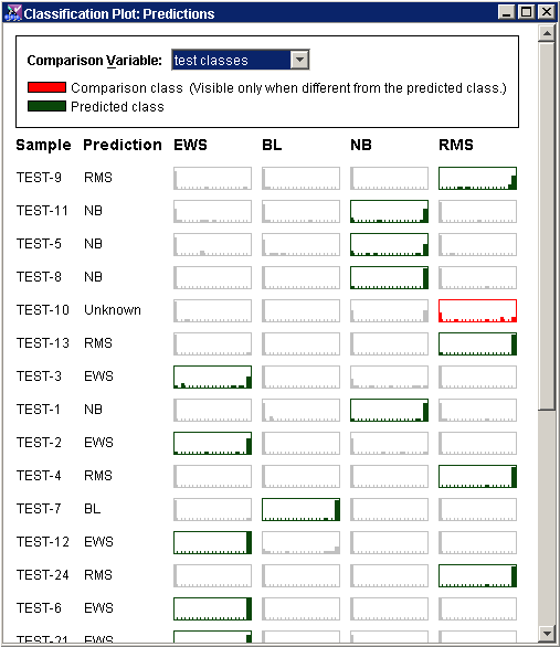
The Classification plot can be used to show the results of classification using a trained classifier.
Description
At the top of the viewer is the legend. Dark green is the color of the predicted class and red is the color of the comparison class, if one is selected. You may choose as a comparison variable any variable of the same variable type as the classifier associated with the same dataset as you are making predictions for.
Each row (sample) has:
Sample name;
Prediction (predicted class);
Class boxes showing the distribution of the votes for each of the possible classes.
A box that is highlighted in dark green is the predicted class for that sample.
A box that is highlighted in red is the true class of that sample as specified in the training classes dataset.
Actions
1. Click a Classified item in the Experiments navigator. The item is highlighted.
2. Select Classification Plot from the Predict menu, or right-click the item and select Classification Plot from the shortcut menu. A Classification plot of the classification results is displayed.
3. In the legend, set the Comparison Variable. The classification plot is updated using the comparison variable information.

Interpretation
The class of a training sample (that has a true class) that has a dark green box and no red box has been predicted correctly.
The class of a training sample that has a dark green box and a red box has been predicted incorrectly.
If no prediction has been made for a sample, it will have no class listed under prediction and no dark green box.
If a training sample has no true class, it will not have a red box.
If the variable you want does not appear in the Comparison variable drop-down list, it may have been imported as a different variable type. Use the Variable Manager to see all the variables available for a given dataset, and what types are assigned to each.
Related Topics:

