|


Tutorial 2: Step 7 Create a Matrix Tree Plot
GeneLinker™ has an excellent set of plots for examining your data. These are described in detail in the Plots section of the online manual.
If the matrix tree plot is already displayed, there is no need to recreate it. Read the sections below the image for information about the plot.
Create a Matrix Tree Plot
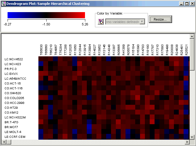
1. Double-click the Sample Hierarchical Clustering
experiment in the Experiments
navigator. It is tagged with the Hierarchical
Clustering icon ![]() . The item is highlighted and a matrix
tree plot of the selected item is displayed. The gene names appear as
the column headings and the sixty cancer cell lines are labels for the
rows.
. The item is highlighted and a matrix
tree plot of the selected item is displayed. The gene names appear as
the column headings and the sixty cancer cell lines are labels for the
rows.
OR
1. If the Sample Hierarchical Clustering experiment in the Experiments navigator is not already highlighted, click it.
2. Click the Matrix
Tree Plot toolbar icon ![]() , or select Matrix
Tree Plot from the Clustering
menu, or right-click the item and select Matrix
Tree Plot from the shortcut menu. A matrix tree plot of the selected
item is displayed.
, or select Matrix
Tree Plot from the Clustering
menu, or right-click the item and select Matrix
Tree Plot from the shortcut menu. A matrix tree plot of the selected
item is displayed.
Matrix tree plots can be manipulated, resized or customized. Please give the following a try:
To Scroll a Matrix Tree Plot
Use the scrollbars to move the plot. Clicking an arrow moves the plot one color tile width at a time. To move more rapidly, click and drag the scroll thumb.
To Identify a Gene or Sample and See the Expression Value
Hover the mouse cursor over the colored tile for which you want to know the value. A tooltip appears displaying the gene name, sample name, and gene expression value. The tooltip disappears as you move the pointer off that tile.
To Change the Color or Scale of the Gradient
1. Double-click the plot legend. The Customize dialog is displayed.
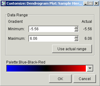
2. Set the parameters to customize the plot.
|
Parameter |
Function |
|
Data Range: Minimum / Maximum |
Type a new value into the Minimum and/or the Maximum field(s) and press <Enter> or use the scroll arrows to set the value(s). The plot is re-drawn using the new values. |
|
Use actual range |
Click the Use actual range button to set the minimum and maximum for the display from the actual minimum and maximum values in the dataset. The plot is re-drawn using the Actual Range values. |
|
Palette |
Click a new color scheme in the Palette drop-down list. The plot is dynamically re-drawn using the new colors. |
3. Click OK to keep the new settings, or click Cancel to revert to the previous ones.
To Resize the Plot
1. Click Resize at the top of the plot. The Resize dialog is displayed.
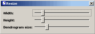
2. Use the sliders to set the width and/or height of the color tiles. The column and/or row labels are not displayed if you set the width or height too small.
3. Click the ![]() icon
in the upper corner of the Resize
dialog to close it.
icon
in the upper corner of the Resize
dialog to close it.
To See Only the Dendrogram (with Sample Labels)
Right-click on the plot, and select Hide Color Matrix from the shortcut menu. The color matrix is removed from view leaving the dendrogram side-by-side with the cell line labels.
Right-click on the plot again and select Show Color Matrix to bring the color matrix back.
When you are finished examining the plots, you can close them.